
BOL.COM
Client: bol.com
Date: April 2025
Team Lead / Author: Jasper Keuskamp (Skyh.co)
The Challenge
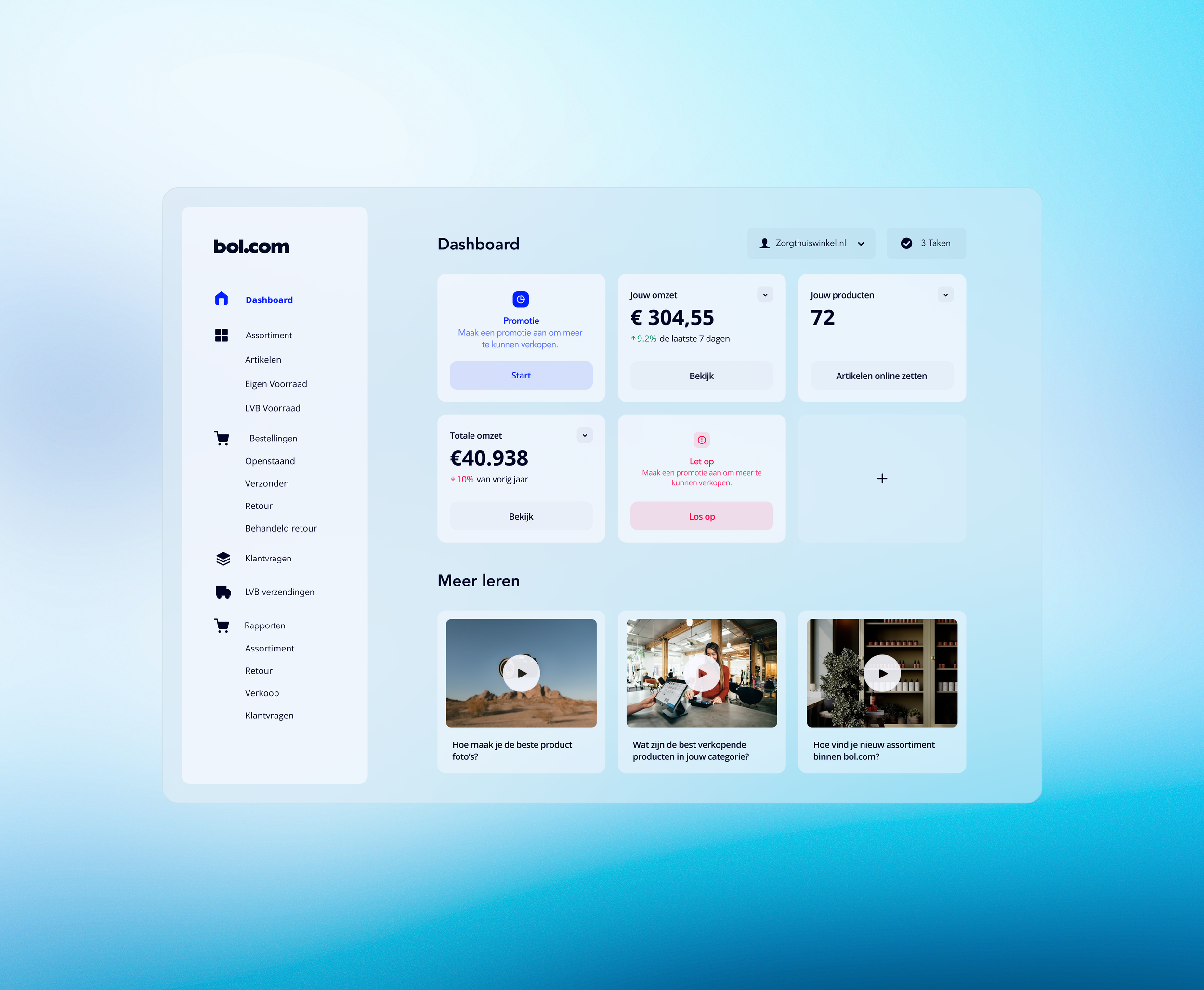
bol.com, one of the largest e-commerce platforms in the Netherlands and Belgium, operates a vast partner ecosystem. Thousands of sellers, ranging from small independent businesses to large enterprise vendors, rely on the Partner Dashboard to manage listings, track sales, optimize pricing, handle logistics, and grow their businesses on the platform.
Despite being feature-rich and data-heavy, the existing dashboard had become a significant pain point. Partners frequently described it as powerful but overwhelming. Key issues included:
Cluttered navigation with menus spanning over 50 pages, making it difficult to find critical tools quickly.
Hidden or poorly presented pricing insights, forcing sellers to hunt for competitive data or manually compare options.
Scalability problems, the interface didn’t adapt well to different partner sizes, leading to frustration for both novice sellers and high-volume enterprises.
High cognitive load during time-sensitive tasks like inventory management, promotions, and performance analysis, which slowed decision-making and reduced overall platform efficiency.
These usability barriers translated into real business impact: lower partner satisfaction, slower adoption of advanced features, increased support ticket volume, and missed opportunities for sellers to optimize their performance on the platform. bol.com needed a redesign that preserved the dashboard’s depth while making it effortless and intuitive for every user.
The Solution
Skyh.co partnered with bol.com to completely reimagine the Partner Dashboard. Our goal was to transform complexity into clarity by creating a streamlined, scalable experience that empowers partners of all sizes to make smarter, faster decisions.
The redesigned dashboard delivers:
Clearer Navigation — A logical, simplified information architecture that surfaces the most important tools and insights upfront.
Smarter Data Presentation — Enhanced visualizations and interactive elements that make complex data immediately actionable.
Modular Design System — A flexible, consistent UI framework that adapts to different partner needs while ensuring long-term maintainability and future extensibility.
The result is a professional-grade tool that feels welcoming to new sellers yet powerful enough for enterprise operations — turning an overwhelming interface into a competitive advantage for partners and the platform alike.
The Process
We applied Skyh.co’s high-velocity, research-driven methodology to ensure the redesign was grounded in real user needs.
Deep Dive into User Feedback We conducted a comprehensive analysis of support tickets, stakeholder interviews, user sessions, and behavioral data. A focused Design Sprint brought cross-functional teams together to prioritize pain points and opportunities. This phase revealed exactly where friction was highest and what success looked like for different partner segments.
Simplified Navigation & Information Architecture We restructured the entire menu system — dramatically reducing complexity from the original 50+ pages into an intuitive, role-aware hierarchy. Emphasis was placed on progressive disclosure: showing advanced options only when relevant.
Interactive Pricing & Insights Tools Designed and prototyped an intelligent pricing comparison tool with visual aids, real-time market data, and recommendation engines. This helped sellers quickly understand competitive positioning and optimize their strategies without leaving the dashboard.
Scalable Design System Development Created a comprehensive, consistent UI component library and design guidelines. This ensured visual and functional coherence across the platform while giving bol.com’s internal teams the tools to iterate independently.
Iterative Testing & Handover Multiple rounds of usability testing with real partners validated improvements. We also provided UX hiring support, onboarding, and detailed documentation to empower bol.com’s team for ongoing evolution.
Throughout the project, we balanced speed with rigor, delivering meaningful improvements without disrupting live operations.
The Outcome
The redesigned Partner Dashboard delivered clear, measurable benefits:
Streamlined navigation that allows partners to find what they need effortlessly, reducing task completion time and frustration.
Clear, actionable pricing insights enabling sellers to make data-driven decisions faster and more confidently.
Improved scalability, a single system that serves small sellers and large enterprises equally well.
Scalable design system that empowers bol.com’s internal teams to iterate quickly and maintain consistency across future updates.
Reduced support load and higher partner engagement with advanced features.
Partners now experience the dashboard as a helpful growth partner rather than a necessary complexity.
What We Delivered
Complete UX/UI redesign of the Partner Dashboard
Simplified navigation architecture and reduced page complexity
Interactive pricing insights and data visualization tools
Modular, future-proof design system with full documentation
User research synthesis, prototypes, and usability testing
UX team mentoring, hiring support, and knowledge transfer
Final Thought
A well-designed system doesn’t just look better, it works better. In the bol.com Partner Dashboard project, we proved that thoughtful simplification and smart information design can unlock the full potential of a complex platform.
By reducing cognitive overload and making powerful tools accessible, we helped bol.com strengthen its partner ecosystem, drive better seller performance, and reinforce its position as a leader in e-commerce innovation. This project exemplifies Skyh.co’s core strength: turning overwhelming complexity into effortless clarity.